
World Data Visualization Prize
Introduced in 2019 edition, the prize focuses on how governments are improving citizens’ lives, and the innovations - seen and unseen - that drive and measure success in this realm.

The Winners
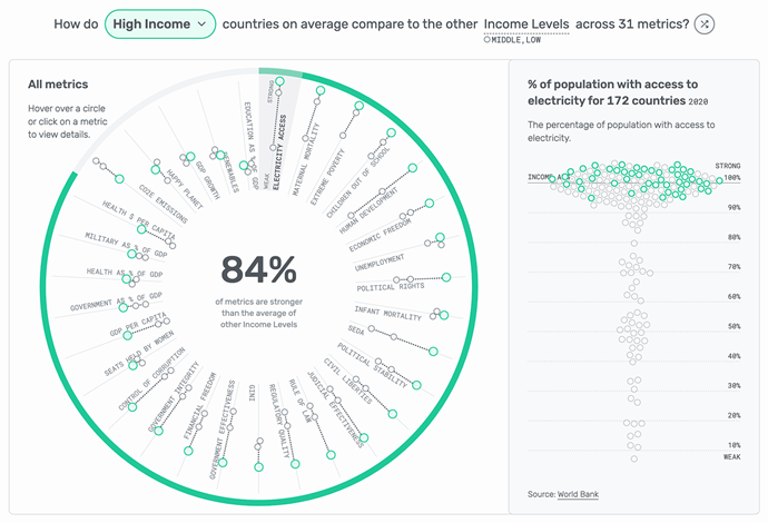
How do we compare?
This dynamic, multi-layered interactive dashboard invites users to focus on an area of interest — an income level, region, or country — and see how it compares to its counterparts across a wide range of metrics. You can randomize the data or choose an individual metric to answer specific questions.
Interactive
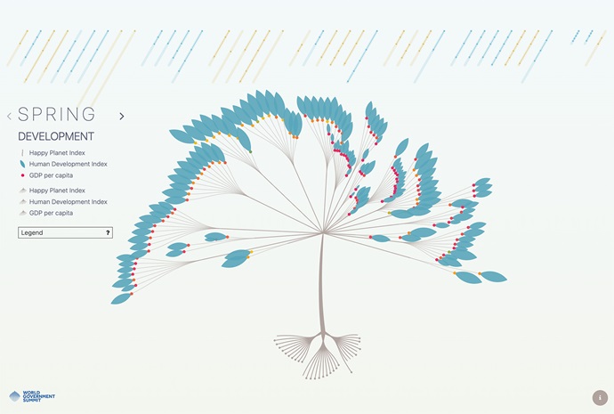
Four Seasons: How Has the World Progressed in Recent Years
This beautifully elegant visualisation uses the metaphor of a tree in different seasons to spotlight different aspects of progress. Hover over the branches to understand the present, the roots to see the past, and the sky to learn about the future
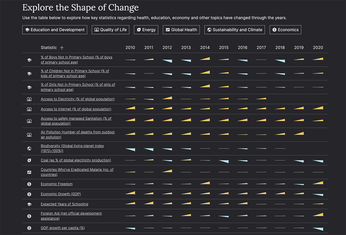
The Shape of Change
Hooking us with an interactive scrolly-telling guessing game, this playful piece reveals and challenges the assumptions people make around key health, the environment, and education metrics.
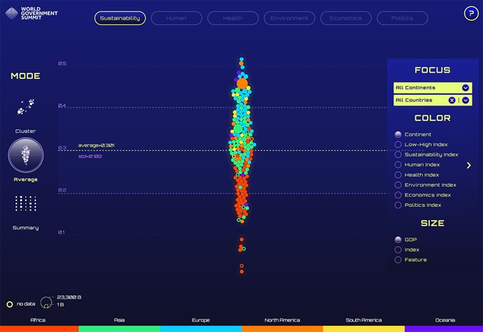
Sustainability Cosmos
This interactive dashboard uses AI and vivid colours to visualise the sustainability performance of countries based on human, health, environmental, economic, and political conditions. Toggle between different modes to uncover interesting patterns ab
Static

The Light We Switch On
Stark black and white imagery shines a light on electricity and energy consumption and production across the world in a intriguing unfolding journey.
Report Card for Humanity
This clarifying infographic challenges the pessimism of progress. By representing change in a “grade” for 5 different categories, you can see what metrics are tending in a positive or negative direction over the last decade.

Happy People, Happy Planet
Do the countries we traditionally define as the happiest also make our environment happy? And is consumption causing net negative or net positive happiness? This poster addresses these questions with incisive graphics.

What Just Happened
This intriguing, colourful infographic folds in data from NASA, the IPCC, and the World Bank to showcase positive improvements from the last 10-years while also highlighting areas of decline or slow growth.
Awards
An annual award designed to promote, motivate, and acknowledge government technology pioneers for providing global smart solutions to common global challenges.

An award that aims to identify and acknowledge outstanding examples of government innovation that have so far flown “under the radar”, and point to emerging new trends.
As part of its dedicated efforts to evolve governments around the world, the World Government Summit hosts the ‘Shaping Future Governments: Global Universities Challenge’.